
Breaking the Grid
Grids are one of those design tools that I didn’t fully appreciate until I began studying design. At first glance, they feel almost invisible. But once you start studying layouts, you realize how much power they have in shaping the entire mood of a piece. Whether it’s a website, a poster, or even something that deliberately breaks the grid, that structure (or disruption of it) makes a huge difference in how the design communicates.

The McQuades site is a perfect example of grid-based design that really works. It’s a studio’s portfolio, so the function here is clear: show off their projects in a way that feels professional but still creative.
The homepage is built around a tight grid, almost like a checkerboard of images and text blocks. Each project sits in its own rectangle, and because the spacing is consistent, your eyes flow easily from one square to the next. The white background gives plenty of breathing room and the typography and high-quality visuals pop without competing against each other. The fonts are modern, sans-serif, and clean.
The grid isn’t just decoration: it’s the backbone of the whole browsing experience. The designers probably wanted to create something that felt straightforward enough to navigate quickly, but also flexible enough to handle all kinds of content. And it works. Nothing feels cluttered, even when the page is filled with different projects.
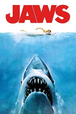
The 1975 Jaws poster is one of the most famous movie posters of all time, and when you look closely, you can see how much it relies on a simple but powerful grid.
At the top, there’s the bold red title in a heavy, sans-serif typeface. Below that, the central image dominates: the swimmer on the surface, the shark rising from below. The alignment here is dead center, dividing the poster vertically in half. The bottom section carries the credits in smaller type, stacked neatly in columns.
The poster uses a limited color palette (red, black, blue, and white) and that restraint makes the design iconic. Red signals danger, blue sets the underwater mood, and the white swimmer pops as the focal point. I think that it is really interesting to use the red for danger but the blue being the real danger. Even if you’ve never seen the movie, the composition alone tells you what’s at stake.
This site has a great behind the scenes story of the poster creation.

On the other end of the spectrum is Wedding to Sardinia, a site that breaks the grid on purpose. Instead of neat columns and rows, the layout feels scattered and overlapping. Images slide across the screen at different angles, text overlaps photos, and the sections don’t align the way you’d expect.
The effect is playful, almost chaotic, but that’s intentional. This is a wedding planning site, and it’s trying to sell an experience that feels vibrant, romantic, and unconventional. By rejecting a strict grid, the designers are signaling that this isn’t a cookie-cutter service. It’s about personalization and creativity.
The fonts are elegant and are paired with warm, soft colors that suggest intimacy and joy. The imagery takes center stage, but it’s framed in ways that feel more like scrapbooking than corporate branding. It’s not about order; it’s about emotion.
From a designer’s perspective, this is risky. Too much disruption and you lose clarity. But here it works because the theme (weddings, love, individuality) matches the style. The lack of a traditional grid communicates freedom and spontaneity, which is exactly what the brand is trying to offer.
Looking at these three examples side by side makes me realize how flexible grids can be. They’re not just about keeping things tidy; they’re a tool to set the mood and guide the eye. The McQuades show how structure can enhance variety, Jaws proves that grids work beautifully in print when combined with bold imagery, and Wedding to Sardinia shows how breaking the grid can create personality and energy.
For me, the big takeaway is that grids aren’t a one-size-fits-all solution. They can be strict, subtle, or even intentionally ignored. What matters is whether the design choices match the story being told. And that’s the part that excites me: finding the right balance between order and chaos to communicate something that sticks with people.