
Breaking the Grid
Grids are one of those design tools that I didn’t fully appreciate until I began studying design. At first glance, they feel almost invisible. But once you start studying layouts, you realize how much power they have in shaping the entire mood of a piece. Whether it’s a website, a poster, or even something that deliberately breaks the grid, that structure (or disruption of it) makes a huge difference in how the design communicates.

The McQuades site is a perfect example of grid-based design that really works. It’s a studio’s portfolio, so the function here is clear: show off their projects in a way that feels professional but still creative.
The homepage is built around a tight grid, almost like a checkerboard of images and text blocks. Each project sits in its own rectangle, and because the spacing is consistent, your eyes flow easily from one square to the next. The white background gives plenty of breathing room and the typography and high-quality visuals pop without competing against each other. The fonts are modern, sans-serif, and clean.
The grid isn’t just decoration: it’s the backbone of the whole browsing experience. The designers probably wanted to create something that felt straightforward enough to navigate quickly, but also flexible enough to handle all kinds of content. And it works. Nothing feels cluttered, even when the page is filled with different projects.
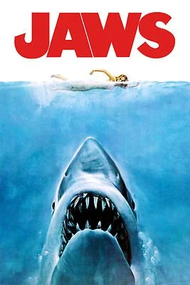
The 1975 Jaws poster is one of the most famous movie posters of all time, and when you look closely, you can see how much it relies on a simple but powerful grid.
At the top, there’s the bold red title in a heavy, sans-serif typeface. Below that, the central image dominates: the swimmer on the surface, the shark rising from below. The alignment here is dead center, dividing the poster vertically in half. The bottom section carries the credits in smaller type, stacked neatly in columns.
The poster uses a limited color palette (red, black, blue, and white) and that restraint makes the design iconic. Red signals danger, blue sets the underwater mood, and the white swimmer pops as the focal point. I think that it is really interesting to use the red for danger but the blue being the real danger. Even if you’ve never seen the movie, the composition alone tells you what’s at stake.
This site has a great behind the scenes story of the poster creation.

On the other end of the spectrum is Wedding to Sardinia, a site that breaks the grid on purpose. Instead of neat columns and rows, the layout feels scattered and overlapping. Images slide across the screen at different angles, text overlaps photos, and the sections don’t align the way you’d expect.
The effect is playful, almost chaotic, but that’s intentional. This is a wedding planning site, and it’s trying to sell an experience that feels vibrant, romantic, and unconventional. By rejecting a strict grid, the designers are signaling that this isn’t a cookie-cutter service. It’s about personalization and creativity.
The fonts are elegant and are paired with warm, soft colors that suggest intimacy and joy. The imagery takes center stage, but it’s framed in ways that feel more like scrapbooking than corporate branding. It’s not about order; it’s about emotion.
From a designer’s perspective, this is risky. Too much disruption and you lose clarity. But here it works because the theme (weddings, love, individuality) matches the style. The lack of a traditional grid communicates freedom and spontaneity, which is exactly what the brand is trying to offer.
Looking at these three examples side by side makes me realize how flexible grids can be. They’re not just about keeping things tidy; they’re a tool to set the mood and guide the eye. The McQuades show how structure can enhance variety, Jaws proves that grids work beautifully in print when combined with bold imagery, and Wedding to Sardinia shows how breaking the grid can create personality and energy.
For me, the big takeaway is that grids aren’t a one-size-fits-all solution. They can be strict, subtle, or even intentionally ignored. What matters is whether the design choices match the story being told. And that’s the part that excites me: finding the right balance between order and chaos to communicate something that sticks with people.
Learning to See
"Expect the unexpected" has been my go to phrase for years, and honestly, it pretty much sums up everything I do. Whether I'm behind the camera, designing graphics, or editing video, there's this constant element of unpredictability that keeps me on my toes. In most other jobs I've had, you could map things out pretty clearly. But part of the joy that comes from sports is you never know what will happen.
You never know when that buzzer-beater is coming. You can't predict when someone's going to score in overtime, or when some random kid in the stands is going to catch a foul ball. These moments just happen, and they're usually the best ones. That's what I love about this work: it keeps me guessing, and it forces me to stay sharp.
Reading that article and assembling my image board got me thinking about all this in a different way. Sure, I can't control what happens on the field or court, but I have complete control over what I do with those moments afterward. I get to decide which shots make the cut, how I edit them, what story they tell together. That's where my creative voice really comes through.

Click the image to see my image board
Which brings me to why I'm working on my website for this course. Don't get me wrong my current site works fine. It gets the job done. But "fine" isn't what I'm going for anymore. I want people to land on my page and immediately think "Okay this person knows what they're doing." I want it to stay with them. I want people to frequently return to my site and use it as a template for others. Right now, my site is perfectly adequate, but not exactly memorable.
There was this one line in the article that really hit me: "we don't see with our eyes, we see with our brain." I've been thinking about that a lot lately. It's so true, especially in creative work. What we notice, what catches our attention, what we think looks good, etc. All of that is filtered through our own experiences and expectations. Two people can look at the exact same design and walk away with completely different impressions. One person might focus on the fonts, another on the color scheme, someone else might not even notice those details but get caught up in the overall mood.
This made me realize I need to think more carefully about who's actually going to be looking at my site. They're not going to scrutinize every little detail the way I do when I'm building it. They're going to form an opinion in three seconds based on their own frame of reference. That's both terrifying and liberating.
The article also pushed this idea that design should prioritize function over aesthetics. I get the logic behind that, but I'm not completely sold on it for what I'm trying to do. In my line of work the visual impact is huge. People are naturally drawn to things that look good first, then they worry about whether it works well. If something looks boring or bland right off the bat, people aren't going to stick around long enough to appreciate how good the fundamentals might be. That's the reality I'm working with.
So my goal is to create something that works beautifully and looks beautiful working, if that makes sense. When I look back at my portfolio, I realize it's never really been about just collecting technically perfect shots. Yeah, I want clean edits and good composition, but what I'm really after is building a collection that adds up to something bigger than the individual pieces. I've gotten better over the years at spotting moments that aren't necessarily the obvious ones but often end up being more powerful.
Sure, the game-winning dunk is exciting, but sometimes what happens right after (the teammate who pulls the shooter into a bear hug, the bench going absolutely crazy, the fan in the front row burying their face in their hands) can be even more compelling than the main event. These are the moments that capture the emotion behind the highlight reel, and learning to recognize them has become second nature.
That's what the article's whole "learning to see" concept meant to me. It's not about documenting everything that happens; it's about developing an eye for which moments actually matter and will resonate with people later.
When I was researching other portfolio sites, Marcus Eriksson's work really stood out. His site just feels right. It has this effortless quality that I really admire. There's variety without it feeling all over the place, and everything flows naturally when you're browsing through it. His logo is understated but effective, the typography is clean without being bland, and his color palette sets the right tone without being distracting. That balance is exactly what I want to achieve.
One of Eriksson’s portfolio pages. Click the image to view his site.

A second portfolio page with a different style

A client page that is simple but effective
After spending more time comparing his site to mine, I've started to see what I'm missing. Don't get me wrong – there are things about my current site that I really like. The buttons that cycle through images add a nice interactive element, and I think my dropdown menus have a unique feel to them that sets them apart from the standard approach. But Eriksson's circular rotating menu is something else entirely. It's both functional and visually engaging in a way that feels almost playful, which is perfect for sports content. There's something about that smooth rotation that just feels more intuitive than traditional dropdowns.

My dropdown buttons

My buttons which cycle through images
I looked at plenty of other approaches too. Some photographers go super minimal: lots of white space, rigid grid layouts, very clean and clinical. Others go the opposite direction with flashy animations and experimental layouts that are almost more about showing off technical skills than showcasing the actual work. Both approaches can work depending on what you're going for, but neither one feels right for me.
Looking at the images for this assignment I naturally gravitate toward cinematic visuals with darker tones and strong contrast. Something about that aesthetic matches the intensity of sports. It feels dramatic and powerful in the right way. For typography, I prefer fonts that are modern and clean but still have some character, which is why I chose to use Georgia. They don't need to be flashy, just confident.
The combination of dramatic imagery with sharp, straightforward type feels like the sweet spot for the kind of work I do. It lets the photos be the star while keeping everything organized and professional-looking.
What really excites me about this whole project is the opportunity to elevate my site to match the level of work I'm actually doing. Sports will always be unpredictable. That's part of what makes it great. But my job is to take that chaos and turn it into something polished and emotional that people will remember.
The article reminded me that good design is about training yourself to see things differently and then using that perspective intentionally. That's what I want my site to communicate: not just the best shots I've captured, but my whole approach to seeing the game, reading the crowd, and finding the stories that happen between the obvious moments.
If I can build something that accomplishes that, then I'll have created more than just another portfolio site. It'll be a genuine reflection of how I work and what I bring to this field.